Overview
While working at Özyeğin University, I spent several semesters teaching in the Speaking Center. The idea behind the center was simple: students could book a one-to-one appointment with a native English-speaking instructor and receive individualized support with speaking, pronunciation, vocabulary, fluency, or whatever else they happened to be struggling with.
Students booked appointments online by scanning a QR code displayed around campus. At the time, appointments were managed through Calendly, although the booking system was later moved into Moodle Scheduler so the university could maintain direct control over the process.
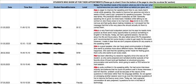
Each appointment lasted 25 minutes. There were four instructors staffing the center, each assigned to specific days and times. When a student booked an appointment, the assigned instructor would receive an email notification. To maintain continuity between sessions, instructors recorded information about each appointment in a shared Google Sheet. We would note the date, time, student name, and a brief summary of what was discussed during the session.
One of the first things I would do after receiving an appointment notification was search the sheet to see whether the student had visited before. If they had, I could review previous notes and get a sense of what had already been covered, which made it easier to plan the session and provide consistent support.
The system worked reasonably well, but over time I began to notice several weaknesses.
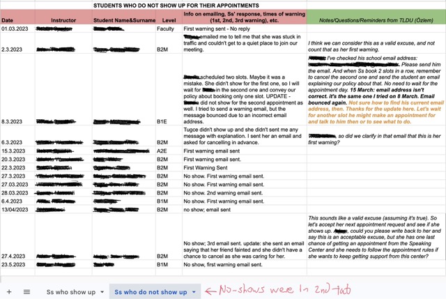
One recurring issue involved students who booked appointments and then failed to attend. Students could cancel appointments themselves through the booking system, which would immediately free the slot for another student and notify the instructor. Occasionally, however, students simply did not show up.
To discourage this behavior, no-shows were recorded and warning emails were sent. After three warnings, a student would lose access to the Speaking Center until meeting with a member of the administrative team. Fortunately, this situation was relatively rare, but tracking attendance and warning levels required more manual work than it should have.
As I spent more time working with the system, I began to realize that the spreadsheet had evolved from a simple appointment log into a critical operational tool. The more important it became, the more obvious its shortcomings became as well.
The Problem
The original spreadsheet was functional, but it had grown organically over time and lacked many of the safeguards and conveniences that make data reliable and easy to manage.
One of the first things I noticed was the lack of data validation. Dates and times were entered manually, which meant there was no guarantee that instructors would record information in a consistent format. This may seem like a minor issue, but inconsistencies quickly become problematic when multiple people are entering data over several semesters.
Student email addresses were not recorded. If an instructor or administrator needed to contact a student, they had to locate the original booking notification and retrieve the email address from there. In practice, this meant switching between multiple systems just to send a simple message.
The spreadsheet was also visually difficult to navigate. Nearly everything was black and white, and important information blended together. Finding what I needed often required carefully reading each row rather than simply scanning for information.
Another limitation was that we had very little information about where students were coming from. Their level was recorded, but there was no reliable way to identify their faculty or department. This made it difficult to understand who was using the service and where demand was coming from.
The no-show system was particularly cumbersome. No-shows were tracked on a separate sheet, and determining whether a student was receiving a first, second, or final warning required manually reviewing previous records. The process worked, but it was inefficient and prone to human error.
I also noticed that many fields relied entirely on free-text input. Instructor names, student levels, and other frequently used information could be entered in different ways by different people. While this might not cause immediate problems, it reduces data quality and makes reporting or analysis more difficult later.
Taken together, these issues created unnecessary administrative work and reduced the reliability of the data being collected. The spreadsheet was doing its job, but I felt it could be doing it much better.
The Solution
When I decided to redesign the spreadsheet, I had several objectives in mind. I should note that nobody asked me to do this. It wasn’t an official project or an assigned task. It was simply a need I identified while using the system, and I thought the workflow could be improved.
One of the first things I focused on was data validation. Dates and times were being entered manually, which left room for inconsistencies. Since the Speaking Center operated on a fixed schedule, this was an easy problem to solve. The date field was tied to a calendar picker, and I added a separate field for the day of the week. Because instructors were assigned to specific days and appointment times were standardized, the time field could also be converted into a drop-down menu rather than relying on manual entry.
I also decided to add student email addresses. My original motivation was not identification, but communication. At the start of each semester, we typically began with a fresh record-keeping document. I thought it would be useful to maintain contact with students who had previously used the Speaking Center so they could be informed about new schedules, invited to special events, or encouraged to continue using the service. In my mind, this was a way to support student engagement and increase the number of returning students.
As the system evolved, I realized that email addresses provided another important benefit: they served as a reliable identifier. Names can be entered incorrectly, instructors may use different spellings or character sets, and students occasionally make mistakes when booking appointments. An email address, however, is unique and easy to copy, search, and verify. It also made contacting a student much more efficient since instructors no longer needed to search through appointment notifications to find the correct address.
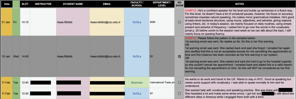
Another objective was improving readability. The original spreadsheet contained a large amount of text, particularly in the session notes field, and important information often became buried in the surrounding data. To address this, I color-coded the columns according to the type of information they contained. This made it easier to scan appointment details quickly without having to carefully read each column heading.
I also wanted administrators to better understand who was using the Speaking Center. To support this, I added faculty and department fields using drop-down menus and visual cues. Students from the School of Languages were highlighted in blue, with their language level displayed automatically. Students from other faculties were highlighted in green, and their available department options were linked to the selected faculty. This allowed administrators to see at a glance where students were coming from and made the data far more useful for reporting and analysis.
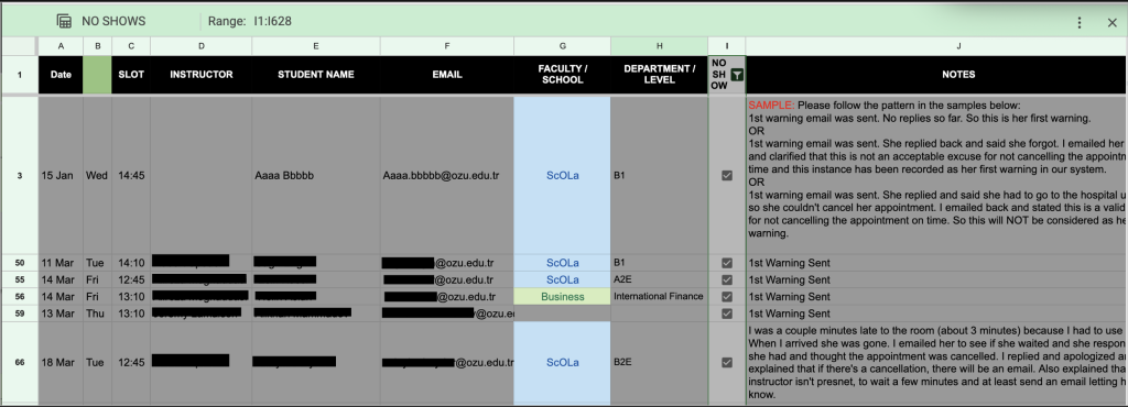
Finally, I wanted to streamline the procedure for no-show students. I thought it prudent to create another column with a checkbox. If that box was checked, then the record would grey out and anything that would be written in the description would be about trying to contact the student. Since the whole record turns grey when the no-show box is checked, it makes it very easy to distinguish no-shows from the rest of the students, and by setting up a simple filter view, all no-shows can be consolidated. This is a more elegant and sophisticated solution than putting the no-shows on a separate tab.
Taken together, these changes were intended to improve data quality, reduce administrative effort, make the spreadsheet easier to use, and create a foundation for future automation and reporting.
Outcome
Once the redesigned document was complete, I shared it with the Teaching and Learning Development Unit, the department responsible for managing the Speaking Center.
The response was overwhelmingly positive. After reviewing the document, they requested a few minor modifications, including converting the instructor field into a drop-down menu and adapting the system for use in another student support program that offered grammar, reading, writing, vocabulary, and listening assistance.
What began as an improvement to the Speaking Center workflow quickly expanded beyond its original purpose. The underlying structure proved flexible enough that it could be adapted to support other academic support services with only minor changes.
Perhaps the most rewarding part of the project came when the Teaching and Learning Development Unit asked me to train them on how the system worked so they could maintain and develop it independently. At that point, I knew the project had become more than a personal workflow improvement. It had been adopted as part of the department’s operational infrastructure.
For me, that was the real measure of success. The goal was never to build a clever spreadsheet. The goal was to solve a problem, make life easier for the people using the system, and leave behind something useful that would continue providing value after I moved on to other responsibilities.